A truly timeless home isn’t built by following trends, but by authoring a personal narrative through deliberate design choices.
- It requires deconstructing common design myths (like ‘white paint always makes rooms bigger’) and mastering the principles of light, texture, and proportion.
- Success lies in the art of curation over mere collection, ensuring every object and finish contributes to your unique story.
Recommendation: Begin by auditing your personal style DNA—found in your wardrobe and values—before ever scrolling through an inspiration feed.
In an age saturated with fleeting social media trends, the quest for a home that feels both authentic and enduring can seem daunting. Many design enthusiasts find themselves caught in a cycle of decorating, only to feel disconnected from their spaces a season later. The conventional wisdom—to create Pinterest boards or simply “buy what you love”—often leads to a collection of beautiful but disparate objects, rather than a cohesive, personal sanctuary. The result is a home that whispers of algorithms and influencers, but fails to speak of its inhabitants.
But what if the secret to a timeless aesthetic wasn’t about finding the right trend, but about abandoning the search for them altogether? What if the key was to shift your perspective from that of a consumer to that of an art director? A personal home aesthetic is not about decoration; it is an act of curation. It’s about building a narrative space where every element, from the subtle warmth of a paint color to the textural dialogue between a vintage chair and a modern sofa, is a deliberate expression of your story, your values, and your life.
This guide moves beyond superficial rules to explore the foundational principles of curating a home with a soul. We will deconstruct common design myths, explore how to create harmony from contrasting styles, and ultimately, show you how to translate your most authentic self into a three-dimensional living experience. It’s time to create a home that doesn’t just look good, but feels like you.
To guide you on this journey of personal curation, this article is structured to address the most pressing questions that arise when moving beyond trends. Each section provides the principles and practical steps to help you make confident, timeless design decisions.
Summary: Curating a Home That Transcends Fleeting Trends
- Why Painting Small Rooms White Doesn’t Always Make Them Look Bigger?
- How to Blend Mid-Century Modern With Industrial Style Without Clashing?
- Large Canvas or Gallery Wall: Which Best Suits a Long Narrow Hallway?
- The “Knick-Knack” Trap That Makes Elegant Rooms Look Messy
- How to Create a Focal Point in a Boxy Room Lackling Architectural Features?
- How to Source and Integrate Vintage Decor Without Your Home Looking Dated?
- How to Design a Living Space That Is Both Instagram-Worthy and Family-Friendly?
- How to Build a Versatile Capsule Wardrobe That Fits Your Body Shape?
Why Painting Small Rooms White Doesn’t Always Make Them Look Bigger?
One of the most pervasive myths in interior design is that a coat of white paint is a universal solution for small spaces. The logic seems sound: white reflects light, making a room feel more open. However, this rule overlooks the most critical element: the quality of the light itself. In a room with poor or limited natural light, stark white walls don’t create an airy expanse; they create a dull, shadowy box that can feel more confining than a darker hue. Since research shows that nearly 90% of our lives are spent indoors, understanding how to manipulate interior light is paramount.
The art director’s approach is not to default to white, but to work with the room’s inherent character. Instead of fighting darkness, embrace it. A deep, moody color like charcoal, navy, or forest green can blur the room’s corners, creating an illusion of depth and intimacy. This technique turns a small room from a limitation into a feature—a cozy, enveloping jewel box. The focus shifts from “making it look bigger” to “making it feel special.” A sensory palette that includes rich color adds sophistication and personality that stark white often lacks.
Furthermore, depth isn’t just about color; it’s about texture. A flat white wall has one dimension. A wall with a tactile finish like limewash, grasscloth, or Roman clay offers subtle variations in light and shadow, adding visual interest and a sense of history without overwhelming the space. As seen in the New Heritage design approach, even neutrals are elevated when they are creamy, warm, and layered, creating an inviting atmosphere rather than a sterile one. The goal is to build a room with layers of character, proving that a space’s impact is not measured in square feet, but in its depth of story.
Your Action Plan for Mastering Small-Space Color
- Assess Light: Determine your room’s natural light direction (north-facing light is cool and blue; south-facing is warm and bright) and observe how it changes.
- Test & Observe: Paint large swatches on different walls and check them at various times of day and night to see how the color truly lives in the space.
- Consider Depth: Don’t be afraid to test deep, moody colors. They can create a sense of intimacy and blur corners, making the room feel more expansive.
- Layer Texture: Explore materials like limewash, plaster, or grasscloth wallpaper to add depth and complexity that paint alone cannot achieve.
- Warm Your Neutrals: If you prefer a light palette, choose whites and beiges with warm undertones (creamy, soft taupe) to prevent the room from feeling cold and sterile.
How to Blend Mid-Century Modern With Industrial Style Without Clashing?
Creating a timeless home often involves becoming a master of synthesis—blending styles to create a unique dialogue. As designer Kaitlin Madden notes, this is the ultimate goal. In her Timeless Interior Design Guide, she states:
Timeless interior design is the ultimate interior design goal. It’s the creation of a home that’s classic and beautiful, and based on tried-and-true design principles. It’s a house that you can refresh and switch up as your style evolves, without having to completely start from scratch because all of your furniture adhered to one specific trend.
– Kaitlin Madden, Timeless Interior Design Guide
Blending Mid-Century Modern (MCM) and Industrial styles is a perfect example of creating this kind of lasting appeal. On the surface, they seem opposed: MCM with its organic forms and warm woods, and Industrial with its raw materials and utilitarian ethos. However, the clash is where the energy lies. The key to a successful blend is not to force them together, but to find the unifying bridge where their core philosophies overlap: a shared commitment to clean lines, functionalism, and the honest expression of materials.
The strategy is to let one style dominate while the other acts as a powerful accent. For instance, in a room with a dominant Industrial feel—exposed brick walls, concrete floors—introduce an MCM icon like a sculptural womb chair or a sleek walnut sideboard. The chair’s organic curves create a beautiful design tension against the room’s hard lines, and its refined form elevates the rawness of the industrial elements. Conversely, in a classic MCM space, industrial-style matte black metal light fixtures or a raw steel-framed coffee table can ground the aesthetic, adding a layer of contemporary edge and preventing the room from feeling like a period-piece museum.
The unifying elements are often found in the details. Matte black metal can serve as the common thread, appearing in the tapered legs of an MCM chair and the frame of an industrial bookshelf. This creates a visual language that connects the two distinct styles, making their pairing feel intentional and curated rather than accidental. This comparative analysis from design experts illustrates how to find harmony in their distinct characteristics.
| Element | Mid-Century Modern | Industrial | Unifying Bridge |
|---|---|---|---|
| Materials | Walnut wood, brass | Raw steel, concrete | Matte black metal accents |
| Forms | Organic curves, tapered legs | Angular, utilitarian | Clean geometric lines |
| Philosophy | Form follows function | Honesty of materials | Authentic craftsmanship |
| Textures | Smooth, refined | Raw, unfinished | Mixed patinas |
Large Canvas or Gallery Wall: Which Best Suits a Long Narrow Hallway?
A long, narrow hallway presents a unique narrative opportunity. It is a space of transition, a visual journey from one part of the home to another. The choice of art here is not merely decorative; it dictates the rhythm and pace of that journey. The decision between a single large canvas and a gallery wall is a choice between two distinct storytelling modes: the singular statement versus the visual rhythm. There is no single “correct” answer; the right choice is the one that best serves the narrative of your home.
A gallery wall transforms the hallway into a chaptered story. It’s an unfolding narrative composed of multiple moments—family photographs, abstract prints, vintage sketches, and personal mementos. This approach is dynamic and personal, allowing for evolution over time as you add, subtract, and rearrange pieces. In a narrow space, a well-curated gallery wall creates a sense of engagement, inviting people to slow down and look closer. The key to success is cohesion: a unified color palette, consistent frame style, or a common thematic thread prevents the collection from feeling chaotic. The grouping should feel like a single, multi-faceted work of art.
Conversely, a single, oversized canvas creates a powerful destination. Placed at the end of the hallway, it acts as a focal point, drawing the eye forward and giving the journey a clear and compelling conclusion. This approach is bold and minimalist. It makes a singular, confident statement and can make the hallway feel more intentional and less of a simple passthrough. The artwork itself becomes the hero, its scale and presence defining the entire character of the space. It turns the hallway from a corridor into a gallery of one.
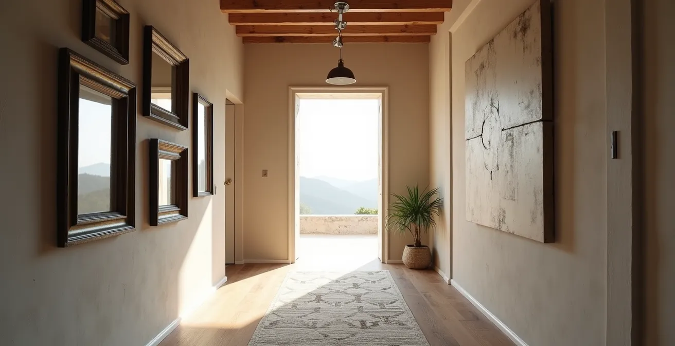
Ultimately, the choice reflects your personal narrative style. Do you express yourself through a collection of interconnected stories, or through one powerful, defining statement? Your hallway is a canvas awaiting its story, and the art you choose is how you will write it.
The “Knick-Knack” Trap That Makes Elegant Rooms Look Messy
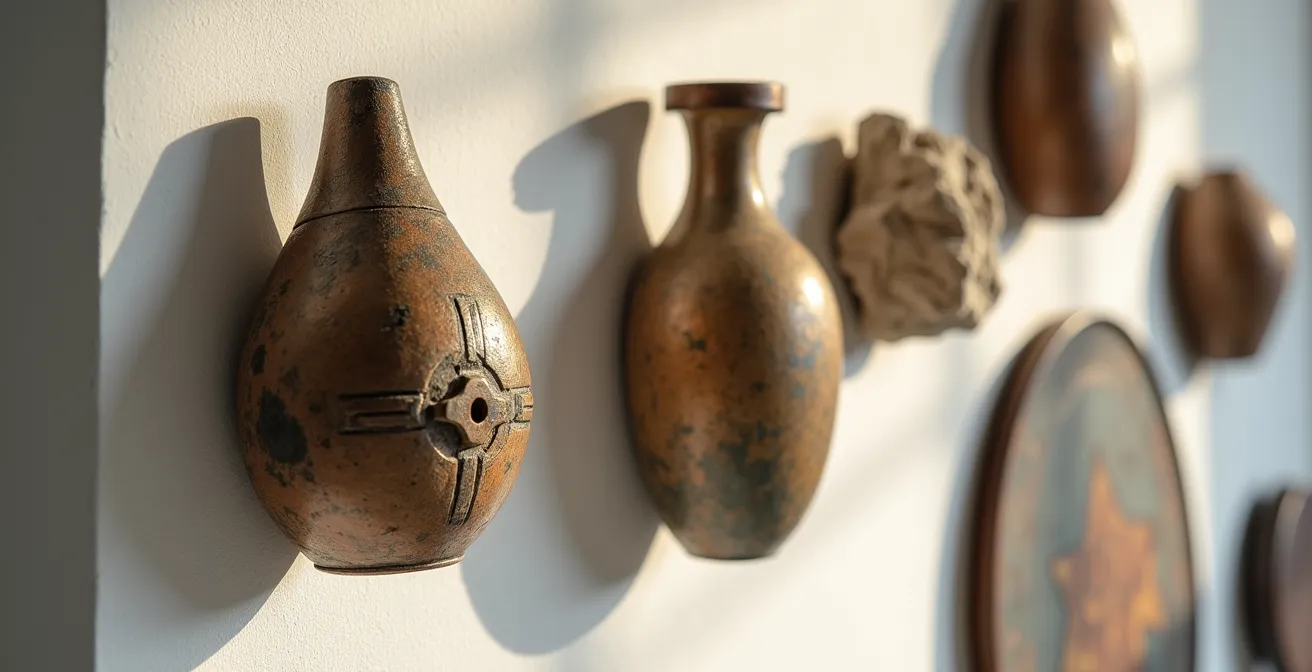
There is a fine line between a room that feels personally collected and one that feels cluttered. This is the “knick-knack trap”—the tendency to accumulate small, decorative objects without a clear curatorial vision. While each item may be loved individually, their collective presence can create visual noise that undermines the room’s elegance and tranquility. The solution is not to live in a sterile, minimalist box, but to adopt the mindset of a museum curator: curation over collection. Every object on display must earn its place.
The principle of “curated simplicity,” as practiced by leading design firms, is transformative. It’s about styling shelves, consoles, and coffee tables so that each piece contributes to a larger story. Instead of a dozen small, unrelated trinkets, a curator would group three to five objects of varying heights, textures, and forms. A handcrafted ceramic vase, a stack of meaningful art books, and a single, sculptural brass object create a compelling vignette. This approach gives each item “breathing room,” allowing its unique form and story to be appreciated. As design experts confirm, a systematic approach can transform cluttered areas into timeless compositions.
To escape the knick-knack trap, practice the art of editing. First, gather all your decorative objects from a single room. Then, evaluate them not just on their individual merit, but on their contribution to the room’s overall narrative. Group items by color, material, or theme. What stories emerge? Which pieces feel redundant? Be ruthless. Return only the most impactful, meaningful, and beautiful objects to the space, arranging them in intentional groupings. Store the rest, and rotate them into your decor seasonally. This practice turns your home from a static display into a living, evolving gallery that reflects your personal journey.
How to Create a Focal Point in a Boxy Room Lacking Architectural Features?
A “builder-grade” boxy room, devoid of a fireplace, charming mouldings, or interesting windows, presents a blank canvas. While this can feel daunting, it’s actually a profound opportunity for an art director. When architecture doesn’t provide a natural focal point, you have the power to create one from pure intention. The key is to think beyond simply hanging a large painting and instead create an experiential focal point—an area that not only draws the eye but also invites an action or an emotion.
One of the most effective strategies is to introduce architectural character where none exists. As Abby Pendergrast of House Beautiful highlights, this adds instant personality. In an article on enduring design choices, she explains:
Built-in details such as crown molding or wainscoting give your space instant character. These features add a little polish without feeling too stuffy, and they make the room feel more custom and unique. Crown molding and wainscoting have been around for ages, and they’re not going anywhere.
– Abby Pendergrast, House Beautiful
Beyond mouldings, consider creating a feature wall with rich, textural wallpaper or a deep, dramatic paint color. This immediately establishes a visual hierarchy in the room. On this feature wall, you can then build your experiential point. For example, create an intentional reading corner with a comfortable, sculptural chair, a beautiful floor lamp that casts a warm glow, and a small side table. This composition is more than just furniture; it’s an invitation to pause, relax, and engage with the space.
Another powerful technique is to mass a personal collection. A curated gallery of black-and-white photographs, a collection of vintage mirrors, or an array of ceramic plates can be grouped together to form a single, large-scale focal point with immense texture and personality. An oversized, dramatic light fixture can also serve as a modern “ceiling medallion,” drawing the eye upward and adding a sculptural element. In a boxy room, your creativity is the most powerful architectural tool you possess.
How to Source and Integrate Vintage Decor Without Your Home Looking Dated?
Integrating vintage pieces is one of the most powerful ways to imbue a home with soul and prevent it from feeling like a showroom. A vintage item brings a story, a patina, and a sense of history that new items simply cannot replicate. However, the fear of a home looking “dated” or like a grandmother’s attic is real. The secret to successful integration is context. A vintage piece will feel timeless and curated when it’s placed in a dialogue with modern elements, creating a dynamic tension between old and new.
The “Modern Heritage” approach offers a perfect blueprint. It involves taking classic furniture silhouettes—like a rolled-arm sofa or a spindle-back chair—and reimagining them. You can achieve this by reupholstering a vintage find in a contemporary fabric, such as a performance linen or a bold geometric print. This immediately bridges the gap between past and present. The piece retains its classic form and craftsmanship, but its new skin makes it feel relevant and fresh. As interior designers confirm, mixing periods is a foundational strategy for creating a truly timeless home that feels collected over time.
When sourcing vintage, focus on pieces with strong, clean lines that can easily coexist with modern decor. Mid-century modern furniture is a natural choice, but so are simpler Art Deco or Gustavian pieces. The 80/20 rule is a useful guide: let 80% of your room’s main furnishings be modern and clean, and let 20% be vintage or antique statement pieces. A vintage Turkish rug can anchor a modern living room, a beautifully aged wooden chest can serve as a side table next to a sleek sofa, or a gilt-framed rococo mirror can hang above a minimalist console. It is this very contrast—the rough against the smooth, the ornate against the simple—that generates visual excitement and tells a rich, personal story.
How to Design a Living Space That Is Both Instagram-Worthy and Family-Friendly?
The perceived conflict between a visually stunning, “Instagram-worthy” space and a durable, family-friendly one is a modern design dilemma. The former seems to call for delicate fabrics, sharp-cornered tables, and pristine surfaces, while the latter demands forgiving materials and soft edges. The art director’s solution is not to choose one over the other, but to achieve a synthesis through smart material choices and strategic design. A home can and should be both beautiful and livable.
The foundation of this synthesis often begins with a neutral palette. As noted in Homes and Gardens, this provides a timeless and elegant backdrop. As author Sara Swabb explains:
A neutral palette is the perfect backdrop for any room. Soft shades of gray, beige, and white offer a timeless elegance and allow other features—whether it’s a statement piece of art or a textured rug—to shine. It’s a calming, clean aesthetic that stands the test of time.
– Sara Swabb, Homes and Gardens
A sophisticated neutral base is inherently photogenic and provides a forgiving canvas for daily life. The key then lies in layering this base with high-performance materials that mimic high-end aesthetics. The era of sacrificing style for durability is over. Today’s performance fabrics offer the look of delicate linen or plush velvet but are engineered to resist stains and wear. A white sofa is no longer a source of anxiety when it’s upholstered in a washable, high-performance fabric. Similarly, rugs made from durable wool or even recycled plastics can provide the texture and pattern of a high-end piece with the resilience needed for high-traffic areas.
The solution is also structural. Instead of a glass coffee table with sharp corners, opt for a large, upholstered ottoman in leather or a durable fabric. It provides a soft surface for children to play around and, with the addition of a beautiful tray, instantly becomes a chic and stable surface for drinks and decor. Storage is another area where style and function can merge. Instead of cluttered open shelves, use beautiful, large woven baskets to conceal toys and clutter. The baskets add texture and warmth—an aesthetic win—while providing practical, family-friendly storage.
This table illustrates how to find the “best of both worlds” solution for common design challenges, proving that a beautiful and functional family home is not a compromise, but a matter of intelligent design.
| Design Challenge | Instagram Appeal | Family Function | Best of Both Worlds |
|---|---|---|---|
| Upholstery Choice | White linen | Dark leather | Performance fabric in neutral tones |
| Coffee Table | Glass and brass | Soft ottoman | Leather ottoman with tray |
| Flooring | Light hardwood | Carpet | Hardwood with washable rugs |
| Storage | Open shelving | Closed cabinets | Beautiful baskets on open shelves |
Key Takeaways
- Timeless design is a narrative act, not a trend-following exercise; your home should tell your personal story.
- Mastering foundational principles—such as light manipulation, textural layering, and creating design tension—is more powerful than adhering to superficial rules.
- True curation is an active process of editing. Every object in your home must earn its place by contributing to the overall aesthetic and narrative.
How to Build a Versatile Capsule Wardrobe That Fits Your Body Shape?
The final and most profound step in curating a personal home aesthetic is to look inward—specifically, into your closet. The principles used to build a successful capsule wardrobe are the very same ones needed to create a timeless, authentic home. Your clothing choices, made over years, are a powerful dataset revealing your true aesthetic DNA: the colors you gravitate towards, the textures that make you feel confident, and the silhouettes that work for you. Translating this personal style language from your wardrobe to your walls is the ultimate act of creating a narrative space.
Begin by auditing your wardrobe. What are the dominant colors you consistently wear and love? These are not the colors of a fleeting trend you tried once, but the reliable hues of your favorite pieces. This is your true color palette. If your closet is filled with shades of navy, cream, and camel, this is the palette that will make your home feel like a natural extension of yourself. Apply these colors to your walls, upholstery, and key textiles.
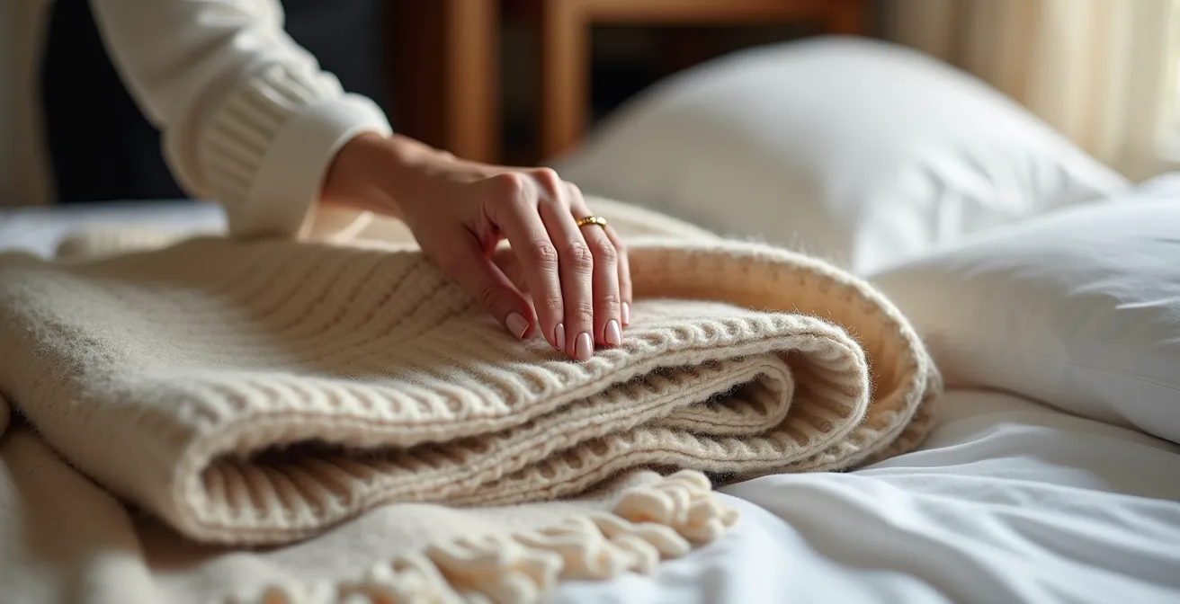
Next, consider texture. Do you love the feel of soft cashmere, crisp linen, or rugged denim? These tactile preferences can be directly translated into home textiles. A love for cashmere can inform the choice of a soft wool or alpaca throw blanket. An affinity for linen shirts can lead to breezy linen curtains. The principles of proportion in fashion also apply. Just as you balance a voluminous top with slim trousers, you can balance a heavy, substantial sofa with chairs on delicate, tapered legs. You can create “outfits” for your rooms, applying the same rules of balance, layering, and color coordination you use every morning.
By using your own wardrobe as the primary source of inspiration, you bypass the noise of external trends and connect with a style that is inherently and authentically yours. Your home ceases to be a space you are trying to decorate “correctly” and becomes a sanctuary that fits you as perfectly as your favorite coat. It becomes the most honest reflection of you.
Your home is your most personal canvas. Begin today to curate a space that is not just decorated, but is a true and timeless reflection of who you are.
Frequently Asked Questions on Curating a Personal Aesthetic
How do I decide between a gallery wall and a single large piece?
Consider your personal narrative style. If your story unfolds through multiple moments and memories, a gallery wall allows for evolving curation. If you prefer one powerful statement, a large canvas creates a destination point.
What’s the ideal spacing for gallery wall pieces in a narrow hallway?
Maintain 2-3 inches between smaller pieces and up to 5 inches for larger ones. The narrow space benefits from tighter groupings to create cohesion rather than scattered placement.
Can I mix both approaches in one hallway?
Yes, you can create a journey that culminates in a visual destination. Consider transitioning from a gallery wall near the entrance to a statement piece at the end of the hall.