The secret to wearing neon isn’t about being loud; it’s about using it as a strategic tool to boost your mood and masterfully define your silhouette.
- Treat neon as a “visual anchor” to give shape to oversized or neutral outfits, drawing the eye exactly where you want it.
- Follow the “Proximity Rule”—keeping unflattering neon shades far from your face—to ensure the color energizes your look, not drains it.
Recommendation: Begin your journey by adding a single, high-quality neon accessory (like a belt or bag) to a timeless neutral piece you already own, such as a classic beige trench coat.
The mere mention of “neon” can send a shiver down the spine of even the most seasoned minimalist. We’re conditioned to associate it with 80s ski jackets or rave culture, not sophisticated, modern style. The fear is real: how do you embrace such a vibrant hue without looking like a walking highlighter? The standard advice is often to “start small” with an accessory or “pair it with denim,” but this rarely addresses the core hesitation. It fails to explain the strategy behind the color.
This is where we shift our perspective. Stop thinking of neon as scary or unprofessional. Instead, think of it as a precision tool in your style arsenal. This guide moves beyond the generic tips to give you a new framework. We’ll explore the psychological power of bright colors, a concept I call “Color Dopamine,” and the science of “enclothed cognition.” You’ll learn not just *what* to wear, but *why* and *how* it impacts your confidence and the way your clothes fit.
The key isn’t to douse yourself in fluorescent shades, but to deploy them with intention. An “Intentional Accent” can redefine a silhouette, add a touch of luxury, and signal a quiet confidence that is anything but loud. We will deconstruct the rules for wearing neon at the office, with pale skin, and even in your home. By the end, you’ll see neon not as a trend to follow, but as a timeless instrument for expressing a dynamic and modern personal style.
To help you master this art, this article is structured to walk you from the psychological foundations to advanced practical applications. Explore the sections below to build your confidence step-by-step.
Summary: A Strategic Guide to Integrating Neon into Your Wardrobe
- Why Wearing Bright Colors Can Actually Boost Your Mood and Confidence?
- How to Use Neon Accessories to Update a Beige Trench Coat?
- Monochromatic or High Contrast: Which Way to Wear Neon Is More Chic?
- The Neon Shade That Makes Pale Skin Look Sick and How to Avoid It
- When Is It Appropriate to Wear Neon in a Professional Office Setting?
- How to Style Oversized Clothing Without Looking Sloppy or Losing Your Silhouette?
- How to Use Color Theory to Choose Makeup Shades That Enhance Your Features?
- How to Curate a Personal Home Aesthetic That Transcends Fleeting Trends?
Why Wearing Bright Colors Can Actually Boost Your Mood and Confidence?
Before you even pick out a neon accessory, it’s crucial to understand the ‘why’. The power of bright color isn’t just an aesthetic choice; it’s a psychological one. This phenomenon, which we can call “Color Dopamine,” is rooted in the idea that the colors we wear can have a tangible effect on our mood and energy levels. Bright, saturated hues are often associated with joy, vitality, and optimism, and wearing them can serve as a subconscious trigger for these positive emotions.
This is backed by the concept of “enclothed cognition,” a term that describes how clothing can systematically influence the wearer’s psychological processes. As researchers Hajo Adam and Adam D. Galinsky found, the symbolic meaning of what you wear can profoundly alter your self-perception. In their study published in the Journal of Experimental Social Psychology, they explored this very connection:
The symbolic meaning of clothing can physically alter your self-perception and actions, making you feel more confident from the inside out.
– Hajo Adam and Adam D. Galinsky, Journal of Experimental Social Psychology
When you choose to wear a flash of neon, you’re not just adding a color; you’re wearing an intention. It signals bravery and a departure from the norm. For the conservative dresser, this small act of rebellion can be incredibly empowering. To ease into this new mindset, you don’t have to leap into a full neon outfit. Instead, build your confidence gradually with a structured approach.
Your Action Plan: Psychological Anchoring for Color Confidence
- Low-Stakes Debut: Start by wearing your new neon item in a safe, low-stakes environment, like at home, for just 30 minutes to get accustomed to seeing it on yourself.
- Quick Errand Trial: Wear it for a short, 15-minute errand, such as grabbing coffee or visiting a local store. The brevity of the interaction minimizes any self-consciousness.
- Supportive Social Setting: Extend the wearing time to a casual lunch or meeting with a supportive friend who will offer positive reinforcement.
- Workday Integration: Once comfortable, incorporate the piece into your regular workday wardrobe, perhaps on a Friday or a less formal day.
- Main Event Moment: Finally, confidently wear the piece to a social event or meeting where you want to make a memorable, positive impression.
How to Use Neon Accessories to Update a Beige Trench Coat?
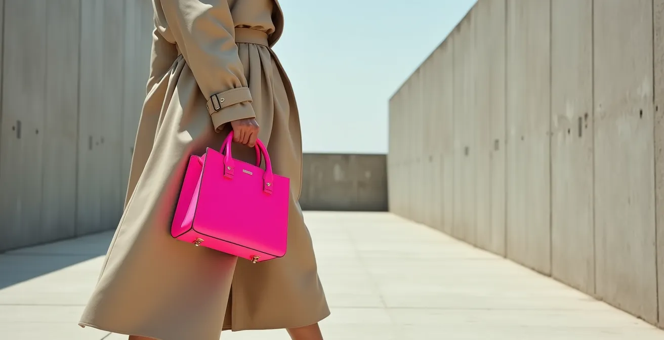
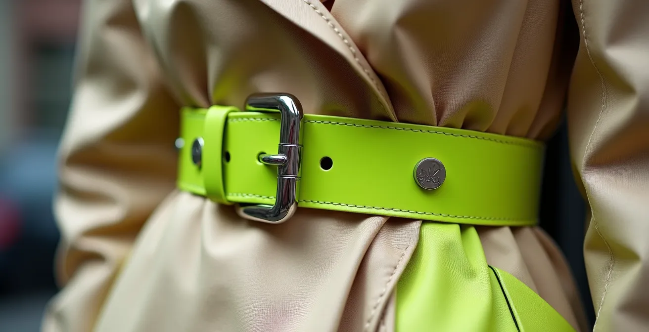
The classic beige trench coat is the perfect canvas for your first foray into neon. It’s a timeless, structured, and neutral garment that provides a sophisticated backdrop, preventing the neon from feeling overwhelming. The key is to treat the neon accessory not as a random addition, but as a strategic Visual Anchor—a single, deliberate point of focus that instantly modernizes the entire look.
A glossy neon belt, for example, does more than just add color. It cinches the waist, creating a defined silhouette against the coat’s volume. A vibrant crossbody bag worn over the trench draws the eye and adds a layer of dynamic energy. This high-impact, low-commitment approach is the safest and most effective way to start. The contrast between the matte, classic fabric of the trench and the slick, modern finish of a patent neon accessory creates a textural dialogue that feels expensive and intentional.
This paragraph introduces the concept of using a neon accessory as a Visual Anchor. To fully appreciate this, the illustration below showcases the powerful contrast between a classic fabric and a modern accent.
As you can see, the neon element commands attention, transforming the trench from a simple classic into a fashion-forward statement. This principle has been proven successful by brands aiming to make their collections feel fresh and accessible.
Case Study: Universal Standard’s Bright Melon Collection Success
Fashion blogger Alison Gary documented how the brand Universal Standard masterfully used a neon yellow shade (“Bright Melon”) across their inclusive size range (00-40) to modernize neutral wardrobes. By showcasing how a single neon belt or bag could transform a classic beige trench, they demonstrated that an Intentional Accent is all it takes to turn a traditional piece into a contemporary statement, proving the commercial and stylistic power of this method.
Monochromatic or High Contrast: Which Way to Wear Neon Is More Chic?
Once you’re comfortable with a single accessory, the next question is how to build an outfit around it. There are two primary schools of thought: tonal layering and stark contrast. Neither is inherently “better,” but they achieve very different effects and suit different occasions. Understanding the difference is key to mastering a chic, intentional look rather than an accidental one.
Stark Contrast, pairing neon with black or crisp white, creates a bold, graphic, and modern statement. This approach is editorial and fashion-forward, perfect for creative environments or when you want your outfit to feel like a deliberate piece of art. A neon green top against black trousers, for instance, is powerful and clean.
Tonal Layering, on the other hand, is about nuance. This involves pairing a neon piece with varying shades of a single neutral family—think a neon yellow sweater with a camel coat, beige trousers, and tan boots. This method softens the neon’s impact, making it feel more integrated and luxurious. It’s an excellent strategy for professional settings or for a more mature, sophisticated take on the trend. As the style editors at HELLO! Magazine note, neutrals are your best tool for control:
Denim will always knock neon down a peg or two, and a humble neutral will never fail to dilute brightness.
– HELLO! Fashion Editors, HELLO! Magazine Style Guide
To help you decide which approach aligns with your goals, this table breaks down the visual effects and ideal contexts for each method. The data is based on an analysis of modern styling techniques from publications like HELLO! Magazine’s style guides.
| Styling Method | Visual Effect | Best For | Perceived Value |
|---|---|---|---|
| Tonal Layering (neon with varying neutrals) | Subtle sophistication | Professional settings, mature style | Luxurious when using quality fabrics |
| Stark Blocking (neon against black/white) | Bold, graphic statement | Creative environments, fashion-forward looks | Modern and editorial with clean lines |
| Bridge Color Method (neon with mid-tones) | Nuanced, effortlessly chic | Versatile for various occasions | Balanced and approachable |
The Neon Shade That Makes Pale Skin Look Sick and How to Avoid It
One of the biggest fears for those with fair or pale skin is that certain neon shades, particularly chartreuse or acid yellow, will wash them out or make them look sallow. This is a valid concern. When a highly saturated, cool-toned color is placed directly next to the face, it can reflect onto the skin, amplifying cool undertones and creating an unflattering effect. But the solution isn’t to avoid these exciting colors entirely; it’s to be strategic about their placement.
This is where the Proximity Rule comes in: the closer a color is to your face, the more impact it has on your complexion. Therefore, to wear a tricky neon shade successfully, you simply need to move it further away from your face. Instead of a neon yellow scarf or turtleneck, opt for neon yellow shoes, a handbag, or a skirt. This allows you to enjoy the color’s energy without it competing with your skin tone. Recent color psychology research confirms this, showing that 80% of perceived skin tone issues with neon can be resolved by creating a distance of 12 or more inches from the face.
This shot of a minimalist white outfit with vibrant neon heels perfectly demonstrates the Proximity Rule in action. The neon provides a powerful statement without affecting the model’s fair complexion.
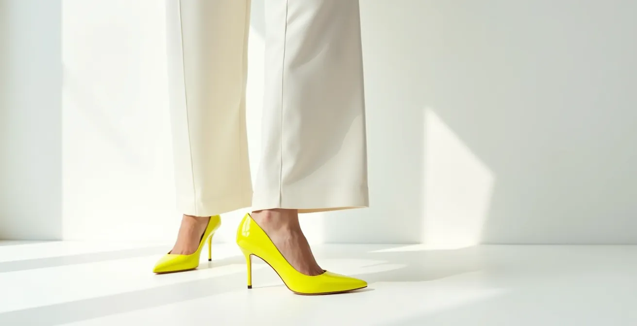
To make this rule practical, think of your body in zones of risk. The further the zone is from your face, the safer it is to place a challenging color there. This simple mental map can eliminate any anxiety about choosing the “wrong” neon.
- High-Risk Zone (Closest to face): Hats, scarves, and high-neck tops are most likely to affect your perceived skin tone. Reserve this zone for universally flattering colors.
- Medium-Risk Zone: Necklaces, earrings, and collared shirts have a moderate impact. Test these with caution.
- Low-Risk Zone: Blazers and cardigans can be worn in tricky neons if you use a neutral inner layer (like a white tee) as a buffer between the color and your neck.
- Safe Zone: Belts, bags, shoes, trousers, and skirts have a minimal effect on your facial appearance and are the perfect place for your most adventurous neon choices.
When Is It Appropriate to Wear Neon in a Professional Office Setting?
The modern office is no longer a sea of navy and grey, but integrating neon requires a deep understanding of your specific work environment. The key is to match the intensity of the neon to the formality of your workplace. What works in a creative agency would be out of place in a conservative law firm. The goal is to signal creativity and confidence, not a lack of judgment. The more corporate the setting, the smaller and more luxurious the neon accent should be.
In a highly conservative environment, think of neon as a personal secret—a flash of a blazer’s lining, the subtle trim on a leather portfolio, or even a high-quality neon fountain pen. These are “hidden accents” that communicate an attention to detail and personal style without breaking dress codes. In a more relaxed business casual setting, a small, high-quality accessory like a silk scarf with a neon pattern or a watch with a neon strap is perfectly appropriate. It shows you’re current and confident.
Interestingly, research suggests that dressing with intention can enhance cognitive function. A study on enclothed cognition by Slepian et al. found that wearing more formal clothing enhanced abstract thinking and helped individuals focus on the big picture. Applying this, a well-chosen, sophisticated neon accent can be part of a “power outfit” that not only looks good but makes you feel sharper and more authoritative.
Use this table as your guide to navigating the spectrum of office formality, ensuring your neon choices are always chic and appropriate.
| Office Type | Appropriate Neon Items | Styling Strategy |
|---|---|---|
| Corporate Conservative | Fine-point neon pen, subtle blazer lining, pocket square edge | Hidden accents, luxury materials only |
| Business Casual | Neon silk scarf, leather portfolio with neon stitching, watch strap | Small accessories in quality materials |
| Creative Industry | Neon shell top under a suit, statement neon pumps, bold handbag | Confident pieces balanced with neutrals |
How to Style Oversized Clothing Without Looking Sloppy or Losing Your Silhouette?
Oversized clothing promises comfort and an effortlessly cool vibe, but it often comes with a risk: losing your shape entirely and looking sloppy. The secret to mastering the oversized trend isn’t to add more volume, but to create a single, sharp Point of Definition. And there is no better tool for this than a pop of neon. By placing a bright, structured neon accessory against a voluminous neutral garment, you create a powerful Visual Anchor that instantly gives your outfit form and intention.
Think of an oversized beige blazer. Left open, it can feel shapeless. But cinch it with a skinny neon pink belt, and you’ve instantly created a waistline. A voluminous white poplin shirt can drown your figure, but a tiny neon green crossbody bag worn high on the torso breaks up the fabric and draws the eye inward, suggesting a silhouette underneath. This “Volume vs. Vibrancy” rule is about contrast: the softness and drape of the oversized piece are balanced by the sharp, energetic line of the neon accent.
Case Study: Strategic Neon Accents with Oversized Neutrals
The fashion retailer Forever Dolled Up brilliantly demonstrated the ‘Volume vs. Vibrancy’ rule in a recent campaign. They paired oversized beige blazers with tiny neon crossbody bags, creating sharp focal points that effectively ‘cinched’ the look without a belt. This strategy proved that a well-placed, structured neon accessory against a voluminous neutral piece creates a more flattering and visually interesting silhouette, leading to increased sales of their collection.
This technique is a reliable formula for looking chic, not sloppy, in oversized fits. It allows you to enjoy the comfort of loose clothing while maintaining a strong sense of personal style and shape.
Action Plan: The Point of Definition Technique
- Identify Your Anchor Point: Before you dress, decide on the single point you want to define. The most common are the waist, ankles, or neckline.
- Add a Singular Neon Accent: Place a bright neon accessory at that specific point and that point only. This creates maximum impact.
- Keep the Volume Neutral: Ensure the oversized piece itself is in a quiet, neutral tone like beige, grey, or white to let the neon anchor do its work.
- Choose Structure Over Flow: Opt for fitted, structured neon accessories (like a rigid bag or pointed-toe shoe) to contrast with the flowing oversized garment.
- Ensure Material Contrast: Pair soft, matte oversized fabrics with glossy or patent neon accessories to create a dynamic and sophisticated textural play.
How to Use Color Theory to Choose Makeup Shades That Enhance Your Features?
Once you’ve curated your neon-accented outfit, the final touch is your makeup. The goal is to create harmony, not competition. When you’re wearing a powerful color like neon, your makeup should play a supporting role, enhancing your features without clashing with your clothes. The most common mistake is trying to match your makeup to the neon—a neon pink lip with a neon pink sweater, for example—which can look dated and overwhelming. Instead, use basic color theory to choose complementary or grounding shades.
The key is balance. If your outfit features a cool-toned neon green, warm up your complexion with a soft, peach-toned blush and a touch of bronze on the eyes. If you’re wearing a warm neon orange, a simple, shimmering metallic highlight in the inner corner of your eyes can create a beautiful “echo” effect without being too literal. For almost any neon, a neutral, well-defined brown eyeshadow and a nude or soft pink lip is a foolproof combination. This grounds the entire look, ensuring the neon piece remains the star of the show.
Think of your face and your outfit as a single composition. The makeup is there to ensure your natural features shine through, preventing the bright color from draining your complexion. This guide will help you harmonize your makeup with your boldest clothing choices.
| Neon Clothing Color | Complementary Makeup | Effect |
|---|---|---|
| Neon Pink | Soft brown eyeshadow, nude lips | Grounds the look, prevents color overload |
| Neon Green | Peach-toned blush, bronze eyes | Warms the complexion, balances cool tones |
| Neon Orange | Metallic inner corner highlight, clear lip gloss | Creates an echo effect without overwhelming |
| Neon Yellow | Coral lip, golden bronzer | Adds warmth to prevent washing out |
Key Takeaways
- Embrace “Color Dopamine”: Acknowledge that wearing bright colors is a psychological tool that can genuinely boost your mood and confidence through “enclothed cognition.”
- Master the “Visual Anchor”: Use a single neon accessory as a strategic point of focus to define your silhouette, especially with neutral or oversized clothing.
- Follow the “Proximity Rule”: Keep potentially unflattering neon shades (like acid yellow on pale skin) far from your face by choosing neon shoes, bags, or skirts.
How to Curate a Personal Home Aesthetic That Transcends Fleeting Trends?
The principles of using neon strategically don’t stop at your wardrobe. In fact, applying them to your home is the ultimate expression of a cohesive personal style. Just as with clothing, the key to a timeless home aesthetic isn’t to chase every trend, but to build a solid, neutral foundation and then layer in personality with intentional, easily swappable accents. Neon, when used correctly, can inject life and modernity into a space without the risk of it feeling dated in a year.
The most effective strategy is the 80/20 Rule. Dedicate 80% of your space to a timeless, neutral foundation: think beige or warm grey walls, a classic sofa, and natural wood or stone textures. This creates a calm, sophisticated canvas. The remaining 20% is your playground for personality and trends, including neon. A single neon vase on a wooden bookshelf, a stack of coffee table books with fluorescent spines, or a single piece of abstract art with a flash of neon can electrify a room.
This approach allows you to engage with trends in a low-commitment way. As the Color Institute notes in its 2025 Color Trends Report, foundational tones are becoming richer, but they still provide the perfect backdrop for bolder statements. They predict a move towards warm neutrals, creating an even better canvas for sharp neon accents.
Expect to see a lot more cafes painted in latte hues, tech gadgets in cocoa finishes, and fashion ensembles built on shades of chocolate, cinnamon, and coffee.
– Color Institute, 2025 Color Trends Report
By treating neon as a jewel-like accent in your home, you ensure your space feels personal and dynamic, yet fundamentally timeless. Use this simple plan to apply the 80/20 rule to your own living space.
- Establish your 80% neutral foundation: Focus on major elements like walls, large furniture (sofa, bed), and flooring in shades of beige, grey, or natural wood.
- Allocate 20% for accents: This is where you bring in color and texture. This includes cushions, throws, art, vases, and books.
- Start small with neon: Introduce a single neon-colored object, like a bright vase or a picture frame, and see how it energizes the room.
- Test with removable items: Before committing to a permanent fixture (like a painted accent wall), test the color with removable items like pillows or posters.
- Rotate seasonally: Keep your space fresh by rotating your 20% accents. A neon yellow cushion might feel perfect for summer, while you might swap it for something deeper in the winter.
Your journey into color is a personal one, but it is guided by these strategic principles. By understanding the psychology, mastering the placement, and respecting the context, you transform neon from an intimidating trend into your most powerful tool for self-expression. The confidence you build is the true statement piece. Now, open your wardrobe and look at those timeless neutrals not as a safe uniform, but as the perfect canvas waiting for its first, brilliant brushstroke.